Rethinking CSS Layouts – More Than Just Flex
TL;DR #
Many developers know only display: block and display: none. Grid, Floats, Flow-Root and Container Queries are always forgotten. This creates weak layouts and too much JavaScript. Here is a short overview with examples when to use what.
How it started #
I work with many developers at a big client. All are experienced, but something is missing. When it comes to layout, I see only Flexbox. Grid, Floats, even simple display types are gone.
Maybe this comes from the fullstack idea. Everyone does a bit of everything, but no one is really strong in CSS. Or maybe we think: React and our design system will solve it. But when we build bigger components, people fail.
So I write here how to build layouts again with CSS, not only Flex.
Semantic Markup first #
Before CSS, you need good HTML. Layout will never be clean if everything is <div>. Use semantic elements:
<header>…</header>
<nav>…</nav>
<main>…</main>
<article>…</article>
<section>…</section>
<footer>…</footer>
This makes code readable, accessible and structured. CSS works better on it.
Grid as the base #
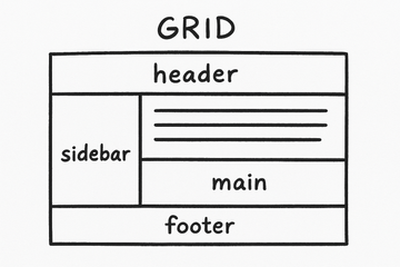
Grid is perfect for large page layouts. A master layout with header, sidebar, main and footer looks like this:
body {
  display: grid;
  grid-template-rows: auto 1fr auto;
  grid-template-columns: 200px 1fr;
  grid-template-areas:
    "header header"
    "sidebar main"
    "footer footer";
  min-height: 100vh;
}

header { grid-area: header; }
aside  { grid-area: sidebar; }
main   { grid-area: main; }
footer { grid-area: footer; }
This gives you a clear base. Inside you can use inline-grid for sublayouts.
Floats and Flow-Root #
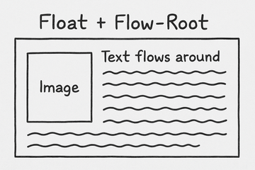
Old tools, but still useful. A picture with text around it is simple with float:
img {
  float: left;
  margin: 0 1rem 1rem 0;
}
To close the container after floats, just use flow-root:
.container {
  display: flow-root;
}
No clearfix hack anymore. Clean and simple.
Flex for small parts #
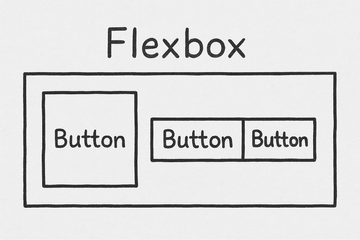
Flex is strong for smaller things. Navigation, button groups, card rows:
nav {
  display: flex;
  gap: 1rem;
}
But please don’t use it for full page layouts. Flex is for rows and columns, not for full grids.
Responsiveness #
Sometimes layout alone is not enough. Grid, Flex or Floats give you the structure, but you also need ways to react to different sizes. This is where Media Queries and Container Queries come in. They work hand in hand with the layout techniques above and make your components really flexible.
Media Queries #
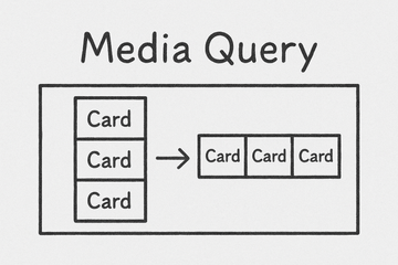
Classic and still needed. They react to screen width:
.card-list {
  display: grid;
  grid-template-columns: 1fr;
}

@media (min-width: 768px) {
  .card-list {
    grid-template-columns: repeat(3, 1fr);
  }
}
Container Queries #
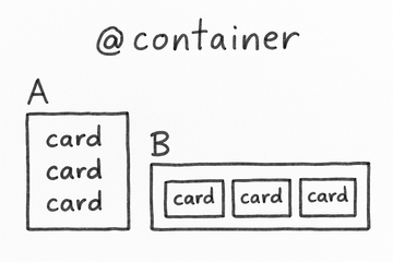
This is the real game changer. The container size counts, not the screen size:
.card-list {
  display: grid;
  grid-template-columns: 1fr;
  container-type: inline-size;
}

@container (min-width: 600px) {
  .card-list {
    grid-template-columns: repeat(3, 1fr);
  }
}
Now a component adapts itself, no matter if inside a small or large container.
Conclusion #
If Flex is your only tool, every layout looks like a Flex problem. Use Grid for structure, Floats for small tricks, Flow-Root for clean containers, Flex for rows, Media Queries for screens and Container Queries for real responsive components.
And don’t forget: everything starts with good semantic HTML. Then CSS will be strong and clear again.